
Chapter 15: Introduction to Graphs
Notes on Chapter 15: Introduction to Graphs
Introduction: Introduction to Graphs
Chapter 15 Introduction to Graphs of Class 8 Mathematics introduces students to the concept of graphs, which are visual representations of data. Graphs help in understanding patterns, trends, and relationships between variables in a clear and concise manner. This chapter lays the foundation for data handling and interpretation, which are essential skills in mathematics and real-world applications. The chapter covers types of graphs, plotting points on a coordinate plane, and interpreting graphs.
1. Understanding Graphs: Introduction to Graphs
A graph is a pictorial representation of data that makes it easier to analyze and interpret information. Graphs are widely used in various fields such as science, economics, and social studies to display data trends and comparisons.
Key Features of Graphs:
-
Axes: Graphs typically have two axes: the horizontal axis (x-axis) and the vertical axis (y-axis).
-
Data Points: These are specific values plotted on the graph to represent data.
-
Labels and Titles: Graphs include labels for axes and a title to describe what the graph represents.
-
Scale: The scale determines the intervals on the axes, ensuring accurate representation of data.
Importance of Graphs:
-
Simplifies complex data for easy understanding.
-
Helps identify trends, patterns, and outliers.
-
Facilitates comparison between different sets of data.
2. Types of Graphs: Introduction to Graphs
The chapter introduces several types of graphs commonly used to represent data. Each type serves a specific purpose depending on the nature of the data.
2.1 Bar Graph
-
Definition: A bar graph uses rectangular bars to represent data. The length or height of each bar corresponds to the value it represents.
-
Uses: Comparing quantities across different categories (e.g., number of students in different classes).
-
Features:
-
Bars can be vertical or horizontal.
-
Bars are of equal width with gaps between them.
-
Each bar represents a distinct category.
-
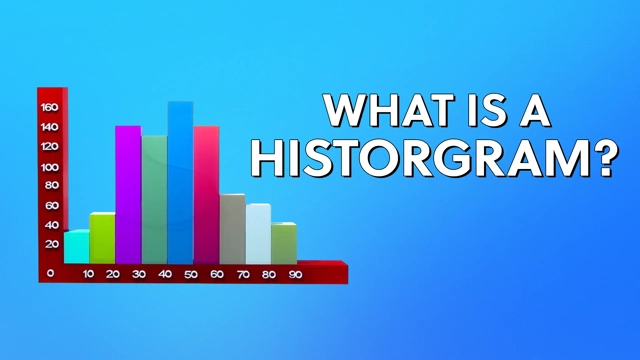
2.2 Histogram
-
Definition: A histogram is similar to a bar graph but represents continuous data. The bars are adjacent with no gaps, indicating continuous intervals.
-
Uses: Showing the frequency distribution of data (e.g., marks of students in a test).
-
Features:
-
Bars represent intervals of a continuous variable.
-
No gaps between bars unless there is no data in an interval.
-
2.3 Pie Chart
-
Definition: A pie chart is a circular graph divided into sectors, where each sector represents a proportion of the whole.
-
Uses: Showing the percentage or proportion of categories within a dataset (e.g., distribution of expenses in a budget).
-
Features:
-
The entire circle represents 100%.
-
Each sector’s angle is proportional to the data it represents.
-
2.4 Line Graph
-
Definition: A line graph uses points connected by lines to show changes in data over time or another continuous variable.
-
Uses: Displaying trends over time (e.g., temperature changes over a week).
-
Features:
-
Points are plotted on a coordinate plane and connected by straight lines.
-
Useful for showing continuous data trends.
-
3. The Coordinate System: Introduction to Graphs
The chapter introduces the Cartesian coordinate system, which is fundamental to plotting graphs.
3.1 Components of the Coordinate System:
-
Axes: The x-axis (horizontal) and y-axis (vertical) intersect at a point called the origin (0,0).
-
Coordinates: A point on the plane is represented by an ordered pair (x, y), where x is the horizontal distance and y is the vertical distance from the origin.
-
Quadrants: The coordinate plane is divided into four quadrants:
-
Quadrant I: (x, y) where x > 0, y > 0
-
Quadrant II: (x, y) where x < 0, y > 0
-
Quadrant III: (x, y) where x < 0, y < 0
-
Quadrant IV: (x, y) where x > 0, y < 0
-
3.2 Plotting Points:
-
To plot a point (x, y), move x units along the x-axis and y units along the y-axis from the origin.
-
Example: To plot (2, 3), move 2 units right and 3 units up from the origin.
4. Plotting a Line Graph
Line graphs are emphasized in this chapter as they are commonly used to represent data trends.
Steps to Plot a Line Graph:
-
Collect Data: Gather the data to be represented (e.g., daily temperatures).
-
Choose Axes: Decide which variable goes on the x-axis (independent variable, e.g., days) and which on the y-axis (dependent variable, e.g., temperature).
-
Determine Scale: Select appropriate intervals for the axes based on the data range.
-
Plot Points: Mark the data points as ordered pairs (x, y) on the coordinate plane.
-
Draw Lines: Connect the points with straight lines to show the trend.
-
Label the Graph: Add a title, axis labels, and a legend if necessary.
Example:
To plot a line graph of temperatures over a week:
-
Data: Monday (20°C), Tuesday (22°C), Wednesday (21°C), Thursday (24°C), Friday (23°C).
-
x-axis: Days (Monday to Friday).
-
y-axis: Temperature (in °C, scale: 1 unit = 5°C).
-
Plot points: (1, 20), (2, 22), (3, 21), (4, 24), (5, 23).
-
Connect the points to form the line graph.
5. Interpreting Graphs
Interpreting graphs involves analyzing the visual representation to draw conclusions about the data.
Key Aspects to Analyze:
-
Trends: Look for increasing, decreasing, or constant patterns (e.g., is the temperature rising over time?).
-
Peaks and Troughs: Identify the highest and lowest points (e.g., the warmest day in a week).
-
Comparisons: Compare values across categories or time periods.
-
Outliers: Note any data points that deviate significantly from the trend.
Example Interpretation:
For the temperature line graph:
-
Trend: Temperature increases from Monday to Thursday, then slightly decreases on Friday.
-
Peak: Thursday (24°C) is the warmest day.
-
Comparison: Tuesday’s temperature (22°C) is higher than Monday’s (20°C).
6. Applications of Graphs
Graphs have practical applications in everyday life and various fields:
-
Education: Tracking student performance over time.
-
Business: Analyzing sales trends or market shares.
-
Science: Representing experimental data (e.g., speed vs. time).
-
Weather Forecasting: Displaying temperature or rainfall patterns.
7. Key Points to Remember
-
Graphs simplify data analysis and make it visually appealing.
-
Choose the appropriate graph type based on the data and purpose.
-
The coordinate system is essential for plotting points accurately.
-
Line graphs are ideal for showing trends over time.
-
Always label axes, use a proper scale, and include a title for clarity.
-
Practice interpreting graphs to understand data patterns and relationships.
8. Common Mistakes to Avoid
-
Using the wrong graph type for the data (e.g., a pie chart for continuous data).
-
Incorrect scaling of axes, leading to misleading representations.
-
Forgetting to label axes or provide a title.
-
Plotting points inaccurately due to confusion with coordinates.
-
Misinterpreting trends by ignoring outliers or incomplete data.
9. Practice Questions
-
Draw a bar graph to represent the number of books read by five students: Anil (4), Bina (7), Chetan (3), Deepa (6), Esha (5).
-
Plot a line graph for the following data: Distance traveled by a car (in km) over 5 hours: (1, 50), (2, 100), (3, 150), (4, 200), (5, 250).
-
Interpret a given histogram showing the marks of students in a class.
-
Identify the coordinates of points plotted on a given graph.
-
Create a pie chart to show the percentage of time spent on daily activities (e.g., sleep, school, play).
10. Conclusion
Chapter 15: Introduction to Graphs equips students with the skills to represent and interpret data visually. Understanding different types of graphs, the coordinate system, and the process of plotting and analyzing data are crucial for mathematical proficiency and real-world applications. By mastering these concepts, students can effectively communicate data insights and make informed decisions based on trends and patterns.
Download pdf notes and Sulutions of the Chapter:
Please Visit Readspot for Hindi Medium Study Material

You may also like

Chapter 1: Rational Numbers

Chapter 2: Linear Equations in One Variable
