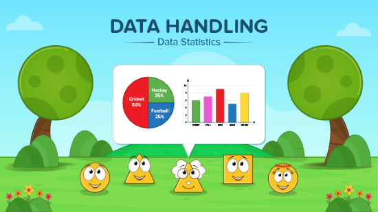
Chapter 5: Data Handling
Class 8 Mathematics Chapter 5: Data Handling
These notes of Data Handling cover the entire NCERT Class 8 Chapter 5 Data Handling syllabus including organising data, graphical representation (bar, double bar, pie chart, histogram), and introduction to probability. Perfect for quick revision before exams!
1. Introduction to Data Handling
Data Handling deals with the process of collecting, recording, presenting, and interpreting data in a meaningful way. Raw data → Organised data → Representation → Analysis
2. Types of Data
- Primary data: Collected by the investigator himself (e.g., survey conducted by you).
- Secondary data: Collected by someone else (e.g., data from newspapers, internet).
3. Organising Data
Grouping Data (Frequency Distribution Table)
When data is large, we group it into class intervals.
Example: Marks of 40 students: 23, 45, 67, 34, 56, 78, 89, 12, 33, 45, … Class intervals → 0–20, 20–40, 40–60, 60–80, 80–100 We put tally marks and count frequency.
Important Terms:
- Class interval: Range of values (e.g., 10–20)
- Class size: Difference between upper and lower limit (20 – 10 = 10)
- Class mark: (Upper limit + Lower limit)/2 → used in calculations
- Frequency: Number of times a value or group occurs
4. Graphical Representation of Data
A. Bar Graph
- Used for categorical data.
- Bars of uniform width, height proportional to frequency.
- Bars do not touch each other (gap is left).
- Can be vertical or horizontal. Example: Number of students in different classes (6th, 7th, 8th, etc.)
B. Double Bar Graph
- Compares two sets of data simultaneously. Example: Boys vs Girls participation in different games.
C. Pie Chart (Circle Graph)
- Represents data as sectors of a circle.
- Whole data = 360°
- Central angle for a component = (Value of component / Total value) × 360°
Steps to draw a pie chart:
- Find total value.
- Calculate proportion of each item.
- Find angle = (Part/Total) × 360°
- Draw circle and mark sectors using protractor.
Example: Favourite fruit of 720 students: Apple – 240, Mango – 180, Banana – 150, Orange – 150
| Fruit | Number | Angle |
|---|---|---|
| Apple | 240 | (240/720)×360° = 120° |
| Mango | 180 | (180/720)×360° = 90° |
| Banana | 150 | (150/720)×360° = 75° |
| Orange | 150 | (150/720)×360° = 75° |
D. Histogram
- Used for grouped frequency distribution of continuous data.
- Bars touch each other (no gap) because class intervals are continuous.
- Height represents frequency.
- Class intervals on x-axis, frequency on y-axis.
Difference between Bar Graph and Histogram:
| Bar Graph | Histogram |
|---|---|
| For discrete data | For continuous grouped data |
| Gaps between bars | No gaps (adjacent bars) |
| Width may vary | Width same, represents interval |
5. Chance and Probability
A. Random Experiment
An experiment whose outcome cannot be predicted with certainty (e.g., tossing a coin, rolling a die).
B. Outcomes and Sample Space
- Tossing a coin → Outcomes: Head, Tail → Sample space = {H, T}
- Rolling a die → Outcomes: 1,2,3,4,5,6 → Sample space = {1,2,3,4,5,6}
C. Event
Any subset of sample space. Example: Getting an even number when rolling a die → {2,4,6}
D. Probability of an Event
P(Event) = Number of favourable outcomes / Total number of possible outcomes
Formula: P(E) = n(E) / n(S) where n(E) = number of outcomes favourable to E n(S) = total number of outcomes (size of sample space)
Important Probability Values
- Probability lies between 0 and 1 → 0 ≤ P(E) ≤ 1
- Impossible event → P = 0
- Certain event → P = 1
- Equally likely outcomes: Each outcome has same chance.
Examples:
- Probability of getting head in a coin toss = 1/2
- Probability of getting 6 on a die = 1/6
- Probability of drawing a red ball from a bag containing 3 red and 7 black balls = 3/10
- Probability of getting a number less than 5 on a die = 4/6 = 2/3
Probability of Combined Events
- Drawing a card from a pack of 52 cards:
- Total cards = 52
- Red cards = 26 (13 hearts + 13 diamonds)
- Black cards = 26 (13 clubs + 13 spades)
- Face cards = 12 (4 Jacks, 4 Queens, 4 Kings)
- Aces = 4
Examples:
- P(King) = 4/52 = 1/13
- P(Red Queen) = 2/52 = 1/26
- P(Black Ace) = 2/52 = 1/26
6. Linking Data Handling with Daily Life
- Weather reports (chance of rain → probability)
- Election surveys
- Sports statistics
- Market surveys
- Medical reports
7. Key Points to Remember (Summary)
- Data → Organise → Represent → Analyse
- Frequency distribution table uses tally marks.
- Bar graphs have gaps; histograms do not.
- Pie chart: Angle = (Component/Total) × 360°
- Probability = Favourable outcomes / Total outcomes
- Coin: 2 outcomes, Die: 6 outcomes, Deck of cards: 52 cards
- Probability ranges from 0 to 1.
8. Common Exam-Oriented Questions (Examples)
- Draw a histogram for the following data:
| Marks | 0-10 | 10-20 | 20-30 | 30-40 | 40-50 |
|---|---|---|---|---|---|
| Students | 5 | 10 | 15 | 12 | 8 |
- A bag contains 4 red, 5 blue, 3 green balls. Find probability of drawing: a) Red ball → 4/12 = 1/3 b) Not blue → 7/12
- Represent the following in a pie chart: Monthly expenses: Food ₹6000, Rent ₹5000, Education ₹3000, Savings ₹4000 Total = ₹18000 Angles: Food 120°, Rent 100°, Education 60°, Savings 80°
9. Tips for Students
- Always label axes in graphs.
- Use proper scale in bar graphs/histograms.
- Double-check central angles in pie charts.
- Simplify probability fractions.
- Remember: Histogram has no gaps, bar graph has gaps.
Download pdf notes and Sulutions of the Chapter:
Please Visit Readspot for Hindi Medium Study Material

You may also like

Chapter 1: Rational Numbers

Chapter 2: Linear Equations in One Variable
