Chapter 9: Data Handling (Best Solution )
Chapter 9: Data Handling-Mathematics

Data Handling :
Data handling is the process of collecting, recording, and presenting data in a way that makes it easier to understand and analyze. It’s a key part of making informed decisions and drawing conclusions from data.
- A data is a collection of numbers gathered to give some information.
- Data obtained in the original form is called raw data.
- To get particular information from the given data quickly, the data can be arranged in tabular form using tally marks.
- The representation of information through pictures is called a pictograph.
- Data can also be represented through bar graphs. In a bar graph, bars of uniform width are drawn horizontally or vertically with equal spacing between them. The length of each bar gives the required information.
Frequency of Data Handling
Frequency is the number of times a particular value occurs in a given data.
Eg: Marks scored by different students in a class: 1, 2, 2, 4, 3, 3.
| Marks | Frequency |
| 1 | 1 |
| 2 | 2 |
| 3 | 2 |
| 4 | 1 |
Organised Data: Data Handling
- Data should be organised properly.
- This helps in extracting information.
- Example: In a class, 20 students were asked to choose one fruit from Banana, Orange, Apple and Guava.
- The following shows organised data for the above information is given below.
| Fruits | No. of Students |
| Banana | 8 |
| Orange | 3 |
| Apple | 5 |
| Guava | 4 |
Prioritizing Data: Data Handling
Data can be prioritized or it can be organised in a particular order according to importance.
Example: Following are the names of students in a class: Anu, Shameer, Kiran, John. Prioritize the data according to alphabetic order. On prioritising the data, the new order of names become Anu, John, Kiran and Shammer.
How to organise data?
Data can be organised in different ways. It can be organised in
(i) Alphabetical order
(ii) In ascending and descending order.
Example: Arrange the following data according to the birth year.
| Ravi | Shekhar | Sunny | Asha |
| 1970 | 1988 | 1979 | 1920 |
Organised data:Data Handling
| Asha | Ravi | Sunny | Shekhar |
| 1920 | 1970 | 1979 | 1988 |
Scaling Factor: Data Handling
The large numbers cannot be represented in a bar graph, so the scaling factor is used to reduce or scale down large numbers.
Pictographs
- The pictograph is a pictorial representation of data.
- Here data is represented using images of the objects.
Interpretation of pictographs
The number of strawberries eaten by various people is shown below.
Bar diagrams: Data Handling
The graphical representation of data using bars of uniform width drawn vertically or horizontally with different lengths is called as bar graphs/bar diagrams.
Bar diagrams consist of two axes: X-axis and Y-axis.
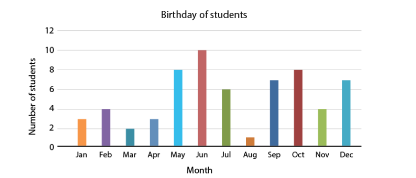
The following is a bar graph showing the birthday of students in a class.
Interpretation of bar diagrams: Data Handling
Given below are the marks scored by students in mathematics. Calculate the sum of marks scored by A and C.
| Students | Marks Obtained |
| A | 8 |
| B | 14 |
| C | 9 |
| D | 5 |
Sum of marks scored by A and C = 8 + 9 = 17
∴ The required sum is 17.
Collection of numbers gathered together to give some valuable information is called data. Pictograph shows numerical information by making use of icons or picture symbols to represent data sets. Pictograph can also be defined as a visual presentation of data using symbols, pictures, icons, etc.
Bar graph
A bar graph is also called a bar chart. It is used to represent data visually with the help of bars which are of different heights or lengths. The date graphed is either horizontally or vertically, to make it easy for the viewers to compare different values and therefore draw conclusions quickly.
The three major attributes of bar graphs are:
The bar graph helps to compare the different sets of data among different groups easily.
It shows the relationship using two axes, in which the categories on one axis and the discrete values on the other axis.
The graph shows the major changes in data over time.
Types of Bar Graphs
The bar graphs can be vertical or horizontal. The primary feature of any bar graph is its length or height. If the length of the bar graph is more, then the values are greater than any given data.
Bar graphs normally show categorical and numeric variables arranged in class intervals. They consist of an axis and a series of labelled horizontal or vertical bars. The bars represent frequencies of distinctive values of a variable or commonly the distinct values themselves. The number of values on the x-axis of a bar graph or the y-axis of a column graph is called the scale.
The types of bar charts are as follows:
Vertical bar chart
Horizontal bar chart
Even though the graph can be plotted using horizontally or vertically, the most usual type of bar graph used is the vertical bar graph. The orientation of the x-axis and y-axis are changed depending on the type of vertical and horizontal bar chart. Apart from the vertical and horizontal bar graph, the two different types of bar charts are:
Grouped Bar Graph
Stacked Bar Graph
Vertical Bar Graphs: When the grouped data are represented vertically in a graph or chart with the help of bars, where the bars denote the measure of data, such graphs are called vertical bar graphs. The data is represented along the y-axis of the graph, and the height of the bars shows the values.
Horizontal Bar Graphs: When the grouped data are represented horizontally in a chart with the help of bars, then such graphs are called horizontal bar graphs, where the bars show the measure of data. The data is depicted here along the x-axis of the graph, and the length of the bars denote the values.
Grouped Bar Graph: The grouped bar graph is also called the clustered bar graph, which is used to represent the discrete value for more than one object that shares the same category. In this type of bar chart, the total number of instances are combined into a single bar. In other words, a grouped bar graph is a type of bar graph in which different sets of data items are compared. Here, a single colour is used to represent the specific series across the set. The grouped bar graph can be represented using both vertical and horizontal bar charts.
Stacked Bar Graph: The stacked bar graph is also called the composite bar chart, which divides the aggregate into different parts. In this type of bar graph, each part can be represented using different colours, which helps to easily identify the different categories. The stacked bar chart requires specific labelling to show the different parts of the bar. In a stacked bar graph, each bar represents the whole and each segment represents the different parts of the whole.
Properties of Bar Graph
Some of the important properties of a bar graph are as follows:
- All the bars should have a common base.
- Each column in the bar graph should have equal width.
- The height of the bar should correspond to the data value.
- The distance between each bar should be the same.
Applications of Bar Graphs
Bar graphs are used to match things between different groups or to trace changes over time. Yet, when trying to estimate change over time, bar graphs are most suitable when the changes are bigger.
Bar charts possess a discrete domain of divisions and are normally scaled so that all the data can fit on the graph. When there is no regular order of the divisions being matched, bars on the chart may be organized in any order. Bar charts organized from the highest to the lowest number are called Pareto charts.
Advantages and Disadvantages of Bar Chart
Advantages:Data Handling
- Bar graph summarises the large set of data in simple visual form.
- It displays each category of data in the frequency distribution.
- It clarifies the trend of data better than the table.
- It helps in estimating the key values at a glance.
Disadvantages:Data Handling
- Sometimes, the bar graph fails to reveal the patterns, cause, effects, etc.
- It can be easily manipulated to yield fake information.
Difference Between Bar Graph and Histogram
The bar graph and the histogram look similar. But it has an important difference. The major difference between them is that they plot different types of data. In the bar chart, discrete data is plotted, whereas, in the histogram, it plots the continuous data. For instance, if we have different categories of data like types of dog breeds, types of TV programs, the bar chart is best as it compares the things among different groups. For example, if we have continuous data like the weight of the people, the best choice is the histogram.
Difference Between Bar Graph and Pie Chart
A pie chart is one of the types of graphical representation. The pie chart is a circular chart and is divided into parts. Each part represents the fraction of a whole. Whereas, bar graph represents the discrete data and compares one data with the other data.
Difference Between Bar Graph and Line Graph
The major difference between bar graph and line graph are as follows:
The bar graph represents the data using the rectangular bars and the height of the bar represents the value shown in the data. Whereas a line graph helps to show the information when the series of data are connected using a line.
Understanding the line graph is a little bit confusing as the line graph plots too many lines over the graph. Whereas bar graph helps to show the relationship between the data quickly.
Draw a Bar Graph
Let us consider an example, we have four different types of pets, such as cat, dog, rabbit, and hamster and the corresponding numbers are 22, 39, 5 and 9 respectively.
In order to visually represent the data using the bar graph, we need to follow the steps given below.
- Step 1: First, decide the title of the bar graph.
- Step 2: Draw the horizontal axis and vertical axis. (For example, Types of Pets)
- Step 3: Now, label the horizontal axis.
- Step 4: Write the names on the horizontal axis, such as Cat, Dog, Rabbit, Hamster.
- Step 5: Now, label the vertical axis. (For example, Number of Pets)
- Step 6: Finalize the scale range for the given data.
- Step 7: Finally, draw the bar graph that should represent each category of the pet with their respective numbers.
Important Questions of Data Handling
Multiple Choice Questions:
Question 1. The maximum marks obtained by any student is
(a) 95
(b) 78
(c) 75
(d) 25.
Question 2. The minimum marks obtained by any student is
(a) 95
(b) 78
(c) 75
(d) 25
Question 3. How many students got the same marks?
(a) 2
(b) 3
(c) 4
(d) 5.
Question 4. The difference between the maximum and mini-mum marks obtained is
(a) 60
(b) 50
(c) 70
(d) 80.
Question 5. How many students got 75 or more marks?
(a) 1
(b) 2
(c) 3
(d) 4
Question 6. How many students got marks below 60?
(a) 1
(b) 2
(c) 3
(d) 4.
Question 7. How many students got marks between 60 and 75?
(a) 1
(b) 2
(c) 3
(d) 4.
Question 8. Following frequency distribution table shows marks (out of 50) obtained in English by 45 students of class VI. Which two classes have the same frequency?
Data Handling
| Class Interval | Frequency |
| 0 – 10 | 1 |
| 10 – 20 | 6 |
| 20 – 30 | 20 |
| 30 – 40 | 12 |
| 40 – 50 | 6 |
| Total | 45 |
(a) 10 – 20 and 40 – 50
(b) 10 – 20 and 20 – 30
(c) 20 – 30 and 40 – 50
(d) None of these
Question 9. The pictograph shows the numbers of goals scored by four soccer teams in a season. How many goals did Kickers score?
- 20
- 10
- 15
- None of these
Question 10. A _______ is a collection of numbers gathered to give some information.
(a) Tally mark
(b) Data
(c) None of these
(d) Frequency
Match The Following: Data Handling
| Column I | Column II | ||
|---|---|---|---|
| 1. | A. | 8 | |
| 2. | B. | 6 | |
| 3. | C. | 5 | |
| 4. | D. | 3 |
Fill in the blanks: Data Handling
- Representation of data with the help of tally marks is called _________.
- In a bar graph width of rectangle is always _________.
- The tally mark represents ________.
- In a bar graph, _______ can be drawn horizontally and vertically.
True /False:
- A bar graph represents data in the form of pictures, object or parts of objects.
- Data is a collection of numerical figures giving required information.
- In a bar graph width of rectangle is always equal.
- The tally mark represents 5.
Very Short Questions:
- A collection of numbers gathered to give some information is called?
- For a math assignment a group of students had to draw their favorite shapes.
The following pictures represent their choices. Each picture stands for 25 shapes.
- A die was thrown 35 times and the following numbers were obtained:
5, 1, 4, 2, 3, 2, 6, 6, 1, 4, 2, 5, 4, 5, 3, 6, 1, 5
2, 6, 2, 5, 4, 1, 3, 2, 1, 4, 1, 6, 2, 6, 3, 3, 3
Prepare a frequency table for the data.
- The result of a Mathematics test is as follows:
80, 90, 70, 80, 80, 60, 80, 70, 90, 65, 100, 60, 70, 60, 70, 85, 65, 70, 70, 85, 90, 60, 65, 80, 60
Make a frequency table for the above data and answer the following questions:
(a) What is the maximum marks obtained?
(b) How many students score less than 75 marks?
(c) How many students scored 80 marks or above?
(d) How many students appeared in the test?
- The colors of fridges preferred by people living in a locality are shown by the following pictograph Which colour most liked by the people?
- In a village six fruit merchants sold the following number of fruit baskets in a particular season:
Observe this pictograph and answer the following questions:
(a) Which merchant sold the maximum number of baskets?
(b) How many fruit baskets were sold by Answer?
(c) The merchants who have sold 600 or more number of baskets are planning to buy a godown for the next season. Can you name them?
- The bar graph shows the number of toys produced by a factory during a certain week:
Answer the following questions:
(a) On which day the maximum number of toys were produced?
(b) On which day equal number of toys were produced?
(c) What is the total number of toys produced during the week?
(d) In which day minimum number of toys were produced?
Short Questions:
- Mr. Rajan made a pictograph given below to show the number of cars washed at a car washing station during three days of a week.
From the pictograph, find that:
(a) How many cars were washed on
(i) Friday
(ii) Saturday
(iii) Sunday?
(b) On which day the maximum number of cars were washed at the station?
(c) On which day the minimum number of cars were washed at the station?
(d) How many more cars were washed on Saturday than on Friday?
- Read the pictograph given below and answer the following questions:
Persons employed in one year
(a) What is the number of persons employed in government service?
(b) How many more person were employed in government service than in private service?
(c) In which service, were the maximum number of persons employed?
- In March 2012, children for six colonies of Meerut were given pulse polio Drops. The colony wise number of children were as follows:
Represent the data by pictograph.
- The given bar graph represents the frequency of a, e, i, o, and u in a piece of English writing.
(a) Which letter occurred the maximum number of times?
(b) Which letter occurred 40 times?
(c) Which letter occurred less than 30 times?
(d) Write down the five letters in the decreasing order of frequencies.
Long Questions: Data Handling
- The marks obtained by six students in Mathematics are given below. Represent the. data by a bar graph. Use a scale of 0.5 cm for each name on the horizontal axis and 0.5 cm for 10 marks on the vertical axis.
- A survey of 120 school students was done to find which activity they prefer to do in their free time:
| Preferred activity | Number of Students |
|---|---|
| Plying | 45 |
| Reading story books | 30 |
| Watching T.V. | 20 |
| Listening music | 10 |
| Painting | 15 |
Draw a bar graph to illustrate the above data taking scale of 1 unit length = 5 students. Which activity is preferred by most of the students other than playing?
Assertion and Reason Questions: Data Handling
1.) Assertion (A) – The maximum marks obtained by any student is 95 out of 100
Reason (R) – Data is a collection of numbers gathered to give some information.
- a) Both A and R are true and R is the correct explanation of A
- b) Both A and R are true but R is not the correct explanation of A
- c) A is true but R is false
- d) A is false but R is true
2.) Assertion (A) – The minimum marks obtained by any student is 100 out of 100
Reason (R) – Data is a collection of numbers gathered to give some information.
- a) Both A and R are true and R is the correct explanation of A
- b) Both A and R are true but R is not the correct explanation of A
- c) A is true but R is false
- d) A is false but R is true
ANSWER KEY -Data Handling
Multiple Choice questions:
- (a) 95
- (d) 25
- (a) 2
Hint:
62, 62
- (c) 70
Hint:
95 – 25 = 70
- (c) 3
Hint:
95, 78, 75
- (d) 4.
Hint:
55, 36, 42, 25
- (c) 3
Hint:
62,62,73
- (a) 10 – 20 and 40 – 50
- (a) 20
- (b) Data
Match The Following: Data Handling
| Column I | Column II | ||
|---|---|---|---|
| 1. | B. | 6 | |
| 2. | A. | 8 | |
| 3. | D. | 3 | |
| 4. | C. | 5 |
Fill in the blanks: Data Handling
- Representation of data with the help of tally marks is called frequency distribution table.
- In a bar graph width of rectangle is always equal.
- The tally mark represents 5.
- In a bar graph, bar can be drawn horizontally and vertically.
True /False:
- False. A pictograph represents data in the form of pictures, object or parts of objects.
- True
- True
- True
Very Short Answer:Data Handling
- Data is collection of numbers gathered to give some information.
- Total pictures = 25
Each picture stands for 25 shapes.
So, Total shapes students drew altogether = 25 × 25 = 625 shapes
- From the given data, we have the following table.
- From the above information, we have the following table.
(a) Maximum marks obtained by a student = 100
(b) 5 + 3 + 6 = 14 students obtained marks less than 75.
(c) 5 + 2 + 3 + 1 = 11 students scored marks 80 or above 80.
(d) Total 25 students were appeared in the test.
- Number of people liked Red colour = 5 × 10 + 5 = 55
Number of people liked White colour = 2 × 10 = 20
Number of people liked Green colour = 3 × 10 = 30
Number of people liked Blue colour = 5 × 10 = 20
Hence, Red colour most liked by the people.
- (a) martin sold the maximum number of baskets.
(b) 7 × 100 = 700 fruit baskets were sold by Answer.
(c) Answer, Martin and Ranjit Singh are planning to buy a godown for the next season.
- (a) The maximum number of toys were produced on Tuesday.
(b) Wednesday and Thursday, Friday and Saturday have equal number of toys were produced.
(c) Total number of toys produced in the week = 175 + 225 + 150 + 150 + 125 + 125 = 900
(d) Minimum number of toys were produced on Friday and Saturday.
Short Answer:Data Handling
- (a) (i) On Friday – 4 × 5 = 20 cars
(ii) On Saturday – 9 × 5 = 45 cars
(iii) On Sunday – 7 × 5 = 35 cars.
(b) On Saturday, the maximum number of cars,
i.e., 9 × 5 = 45 were washed at the stations.
(c) On Friday, the minimum number of cars,
i.e., 4 × 5 = 20 were washed on the station.
(d) 45 – 20 = 25 more cars were washed on Saturday than on Friday.
- (a) Number of persons employed in government service = 10 x 3000 = 30,000
(b) 10 x 3000 – 6 x 3,000 = 30,000 – 18,000 = 12,000 persons were employed more in government service than in private service.
(c) In government service, the maximum number of persons were employed.
- Pictograph:
- (a) a letter occurred the maximum number of times.
(b) i letter occurred 40 times.
(c) u letter occurred less than 30 times.
(d) a, e, o, i, u is the decreasing order of their frequencies.
Long Answer:Data Handling
- The required bar graph is given as below:
- (1) Draw two perpendicular lines – one vertical and one horizontal.
(2) Along horizontal line mark the “Preferred activity” and along vertical line mark the “No. of students”.
(3) Take bars of same width keeping uniform gap between them.
(4) Take scale of 1 unit length = 5 students along the vertical line and then mark the corresponding values.
(5) Calculate the heights of the bars for various activities preferred as shown below:
| Playing | 45 ÷ 5 = 9 units |
| Reading story books | 30 ÷ 5 = 6 units |
| Watching T.V. | 20 ÷ 5 = 4 units |
| Listening music | 10 ÷ 5 = 2 units |
| Painting | 15 ÷ 5 = 3 units |
(6) Now draw various bars.
The activity “Reading story books” is preferred by most of the students other than playing.
Assertion and Reason Answers:Data Handling
1) d) A is false but R is true
2) d) A is false but R is true
Download PDF Notes and Excercise solution of the Chapter- Data Handling
Please Visit Readspot for Hindi Medium Study Material

You may also like
")
Chapter 1: Knowing Our Numbers ( Best Solution )
")
Chapter 2: Whole Numbers ( Best Solution )

1 Comment